A plain-English guide to technical analysis for crypto beginners
Price can moon 10x on hype alone — or crash 80% overnight. Ask anyone who FOMO’d into a memecoin at the top. The difference between those who survive crypto and those who get wrecked often comes down to one thing: reading the market’s mood through charts, not guessing based on X (Twitter) threads.
That’s what Technical Analysis (TA) is. In plain terms, it’s the art of studying past price and volume data to estimate what might happen next. It’s not a crystal ball. It’s probability — like reading weather patterns. A meteorologist can’t guarantee rain, but they sure can say “70% chance of storm.”
Compare it to Fundamental Analysis (FA), which is about whether a project is worth investing in — team, tokenomics, utility. Think of it this way: FA picks the horse; TA times when to bet.
Used together, they’re powerful. This guide won’t make you a trading guru overnight, but after reading it, you’ll know how to:
- Identify trends before they’re obvious
- Spot support and resistance levels
- Use a handful of key indicators without overloading yourself
- Avoid the most common beginner mistakes
Let’s get into it.
1. Why TA Matters in Crypto (Especially for Beginners)
Crypto is a unique beast. Unlike stocks, it trades 24 hours a day, 7 days a week, 365 days a year — no circuit breakers, no market close, no regulators pumping the brakes. That non-stop volatility is brutal for newcomers, but it also means:
- Chart patterns form faster and more clearly than in traditional markets
- A pattern that takes months to play out in stocks can unfold in days or weeks in crypto
- Emotional extremes — panic and greed — are amplified, which makes TA signals louder
Here’s why that matters for you:
- Helps you avoid buying tops and selling bottoms — the two most expensive beginner habits
- Reduces emotional decisions — when you have a chart-based plan, you’re less likely to panic-sell at 3am
- Complements FA beautifully — strong fundamentals + a well-timed entry = much better odds
2. Chart Basics: What You Actually Need
Before diving into patterns and indicators, you need to get comfortable with the screen itself.
Timeframes
Not all charts are created equal. The same asset can look like a strong uptrend on one timeframe and a chaotic mess on another.
| Timeframe | Best For |
|---|---|
| 1-hour (1H) | Short-term swing trades, day trading |
| 4-hour (4H) | Swing trading, spotting medium setups |
| Daily (1D) | Position trading, identifying major trends |
| Weekly (1W) | Long-term holds, big-picture structure |
Rule of thumb: Always start with the higher timeframe (weekly/daily) to understand the big picture, then zoom into lower timeframes to fine-tune entries.
Candlestick Charts: Your New Best Friend
Forget line charts for now. Candlestick charts show you four key data points in every candle:
- Green candle = price closed higher than it opened (buyers won)
- Red candle = price closed lower than it opened (sellers won)
- Long wicks = strong rejection at that price level (important signal!)
- Small body, long wick = indecision — trend may be changing
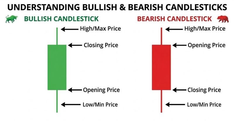
Chart Types Compared
| Type | Shows | Use It? |
|---|---|---|
| Line chart | Close price only | Quick overview, not for analysis |
| Bar chart | Open, high, low, close | Fine, but harder to read |
| Candlestick | Open, high, low, close + colour | Yes — use this one |
Where to View Charts (Free Tools)
- TradingView (tradingview.com) — the gold standard. Free tier is excellent.
- CoinGecko / CoinMarketCap — good for quick price checks, basic charts
- Your exchange (Binance, Coinbase, Kraken) — built-in charts, useful but limited
3. Core Concepts Every Beginner Should Know
Trends: The Market’s Direction
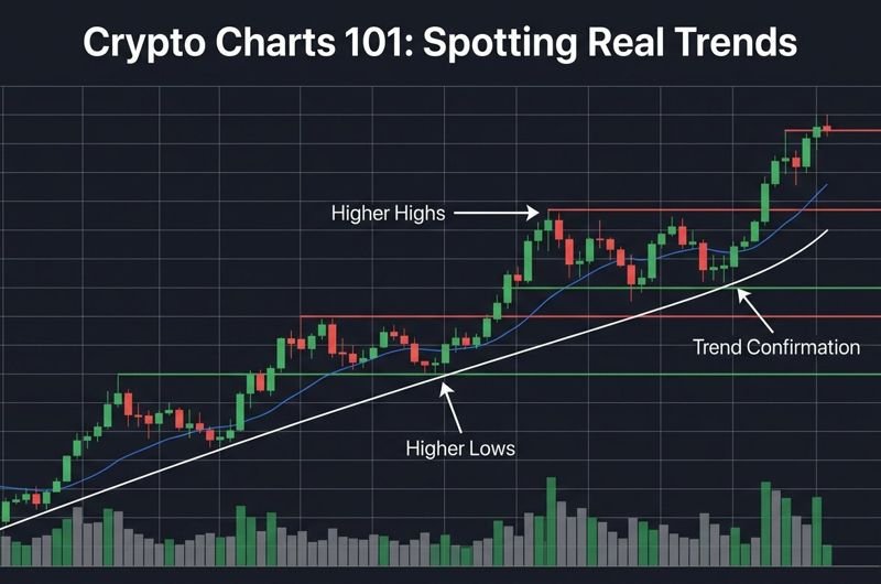
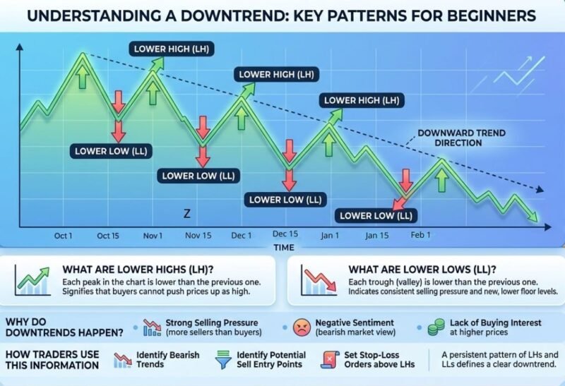
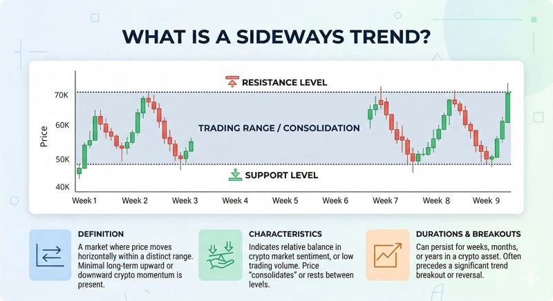
Markets do three things: go up, go down, or go sideways. Identifying which one you’re in is the single most important skill in TA.
- Uptrend: Series of higher highs (HH) and higher lows (HL)
- Downtrend: Series of lower highs (LH) and lower lows (LL)
- Sideways (Consolidation): Price bouncing between a horizontal range — neither bulls nor bears in control
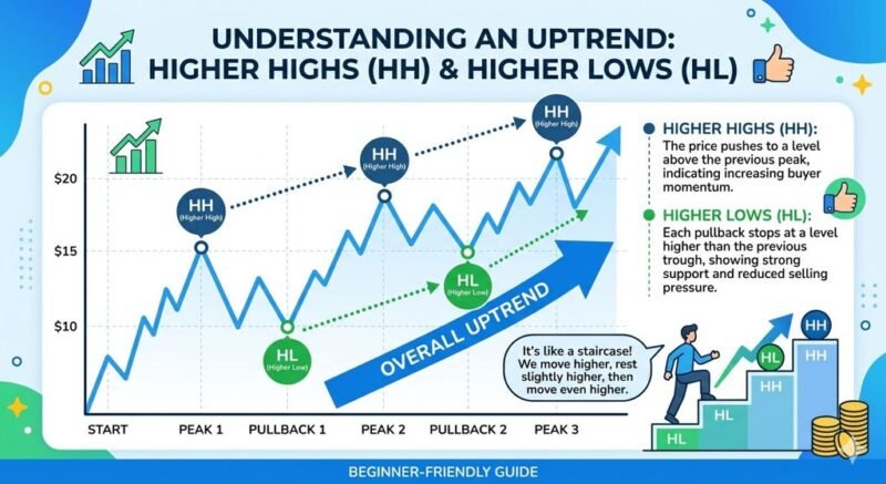
Trendline tip: Connect at least two higher lows to draw an uptrend line. The more times price touches and respects a line, the more significant it is.
Support & Resistance: Floors and Ceilings
- Support = a price level where buying pressure historically stops a fall. Think of it as the floor.
- Resistance = a price level where selling pressure historically stops a rally. The ceiling.
Why do these work? Psychology. Traders remember where price reversed before and act accordingly.
Role Reversal: This is key — once price breaks through resistance and holds, that old resistance becomes the new support.
Volume: The Market’s Conviction Meter
Volume tells you how many people are participating in a move. It’s the difference between a real trend and a fakeout.
- High volume breakout = strong conviction, move likely to continue ✅
- Low volume breakout = thin ice, likely to reverse ⚠️
- Price rising, volume dropping = trend losing steam, possible reversal ahead
Always confirm breakouts with volume. A candle that breaks resistance on 5x average volume is very different from one that barely squeezes through on minimal volume.
Chart Patterns: The Ones Worth Knowing
There are dozens of patterns. Here are the five you’ll actually see again and again:
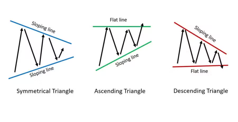
1. Ascending Triangle → Bullish Continuation
Flat resistance top + rising lows = buyers getting more aggressive. Usually breaks upward.
2. Descending Triangle → Bearish Continuation
Flat support bottom + falling highs = sellers pressing down. Usually breaks downward.
3. Symmetrical Triangle → Continuation (either direction)
Both sides converging. A coin-flip until it breaks one way — watch volume for the clue.
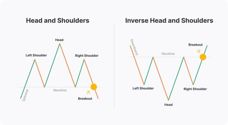
4. Head & Shoulders → Bearish Reversal
Three peaks (left shoulder, taller head, right shoulder), with a “neckline” support. Break of the neckline = bearish signal. The inverse (upside down) is bullish.
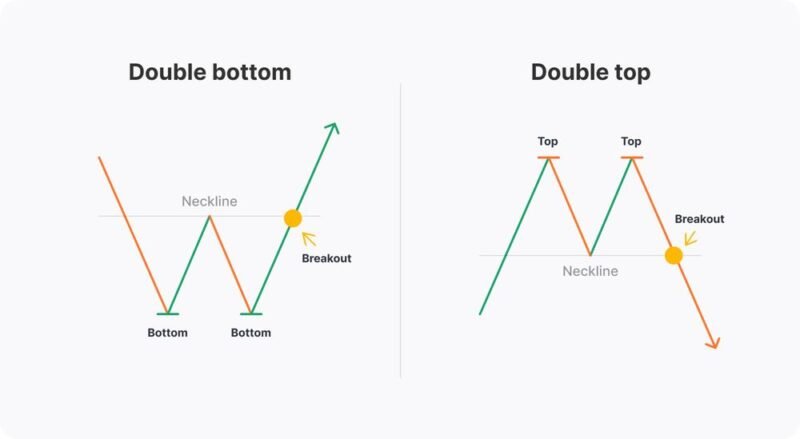
5. Double Bottom / Double Top → Reversal
Price tests a level twice, can’t break it, then reverses. A “W” shape (double bottom) is bullish; an “M” shape (double top) is bearish. Very common and reliable.
Remember: No pattern is 100% reliable. Always confirm with volume, the overall trend, and other indicators. These are probabilities, not guarantees.
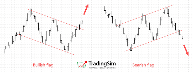
Also watch for: Flags and pennants — short consolidation periods mid-trend that often lead to continuation. If BTC rallies hard then consolidates in a tight range for a few days, that’s often a bull flag.
4. Must-Know Indicators (Start with These 3–4 Only)
Indicators are mathematical calculations applied to price and volume data. They help confirm what the chart is already showing. The mistake most beginners make? Loading 10 indicators on one chart and getting paralysed.
Start with three. Master those. Add more later.
1. Moving Averages (MA): The Trend’s Backbone
A moving average smooths out price noise by averaging closing prices over a set period.
- SMA (Simple Moving Average): Equal weight to all periods. Slower.
- EMA (Exponential Moving Average): More weight on recent prices. Faster, more reactive.
The SMA vs. EMA Battle
Traders generally choose between two types of averages. While they look similar, they tell very different stories:
| Feature | SMA (Simple) | EMA (Exponential) |
| Calculation | Equal weight to all data points. | More weight on recent price action. |
| Speed | Slower. Ignores short-term volatility. | Faster. Reacts quickly to price swings. |
| Best Use | Macro Trends. The “Gold Standard” for long-term cycles. | Short-term Trading. Finding entries on daily/hourly charts. |
The ones to watch:
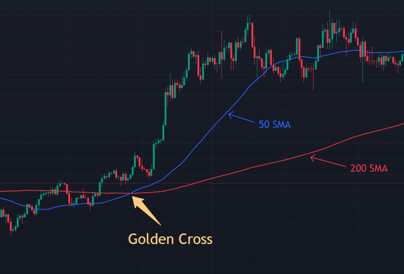
- 50 MA — short-to-medium term trend.
- 200 MA — the long-term trend line. Price above it = bull market. Below it = bear market.
Golden Cross: 50 MA crosses above 200 MA → strong bullish signal. BTC’s golden cross in early 2024 confirmed the long-term macro shift, preceding the push toward new all-time highs.
Death Cross: 50 MA crosses below 200 MA → bearish signal.
MAs also act as dynamic support/resistance — price frequently bounces off them in trending markets.
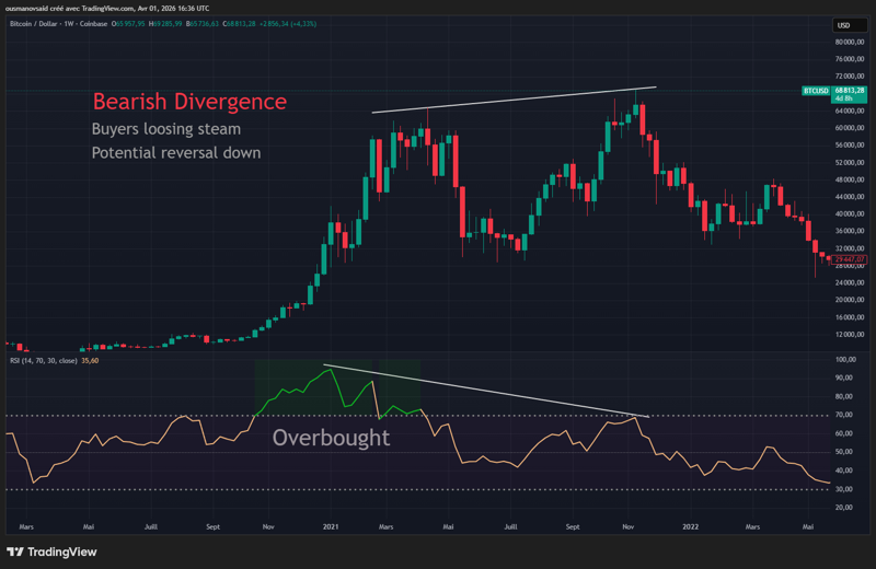
2. RSI (Relative Strength Index): Overbought or Oversold?
RSI measures the speed and magnitude of price changes on a scale from 0 to 100.
- Above 70 = overbought (market may be due for a pullback)
- Below 30 = oversold (market may be due for a bounce)
- 50 level = the dividing line between bullish and bearish momentum
⚠️ In a strong uptrend, RSI can stay above 70 for a long time. “Overbought” doesn’t mean “sell immediately.”
The real gem: RSI Divergence
- Bullish divergence: Price makes a lower low, but RSI makes a higher low. Sellers losing steam → potential reversal up.
- Bearish divergence: Price makes a higher high, but RSI makes a lower high. Buyers losing steam → potential reversal down.
This is one of the most powerful signals in TA when confirmed by other factors.
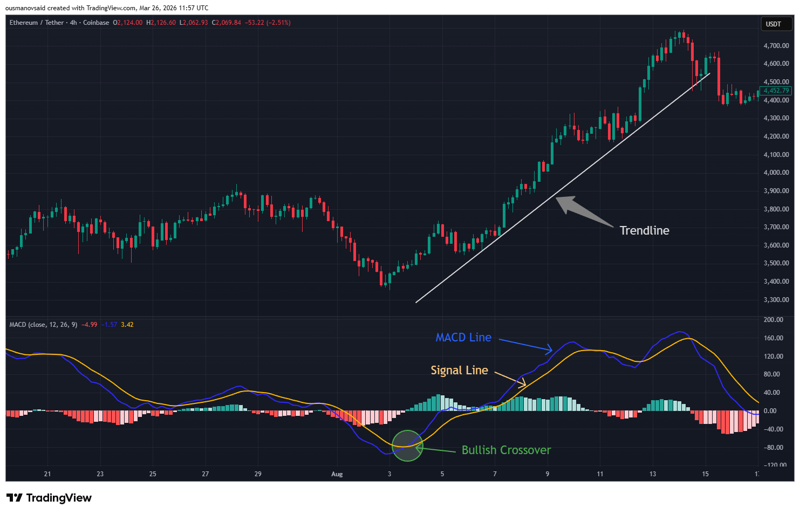
3. MACD (Moving Average Convergence Divergence)
Sounds complicated. It’s not. MACD tracks the relationship between two EMAs (typically 12 and 26 periods) and shows momentum shifts.
What to look for:
- MACD line crosses above Signal line = bullish momentum building
- MACD line crosses below Signal line = bearish momentum building
- Histogram (the bars) shows the strength of that momentum — growing bars = strengthening trend
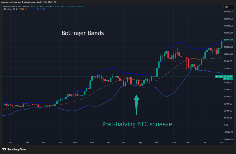
4. Bollinger Bands (Bonus — Slightly Advanced)
Three bands: a 20-period SMA in the middle, with bands two standard deviations above and below. When the bands squeeze close together, it signals low volatility — and low volatility almost always precedes an explosive move.
Watch for the squeeze, then watch for which direction price breaks out of it. The post-halving BTC squeeze in mid-2024 is a textbook example.
How to combine them (the pro way): Use the 200 EMA as your trend filter (only take long trades when price is above it). Then wait for RSI divergence or MACD crossover for timing. Bollinger squeeze gives you the ‘explosion is coming’ heads-up. Three tools, one clear story.
5. Simple Step-by-Step: How to Analyse a Chart in 10 Minutes
Here’s the workflow. Do this every time — it becomes second nature quickly.
✅ The 10-Minute Chart Checklist
| Step | Action | What You’re Looking For |
|---|---|---|
| 1. Zoom Out | Start on weekly, then daily | What’s the overall trend? Bull, bear, sideways? |
| 2. Draw the Trend | Mark higher highs/lows or lower highs/lows | Are you trading with or against the trend? |
| 3. Mark Key Levels | Horizontal support & resistance lines | Where might price bounce or stall? |
| 4. Check Volume | Look at volume bars below price | Does the trend have conviction? |
| 5. Add Indicators | RSI + MACD (or MAs) | Confirm or contradict what the chart is showing |
| 6. Spot Patterns | Triangles, H&S, double tops/bottoms | Is there a setup forming? |
| 7. Decide | Entry? Wait for confirmation? Avoid? | Never force a trade — “no trade” is a valid answer |
6. Common Beginner Mistakes (Don’t Learn These the Hard Way)
🚫 Chasing Pumps Without Confirmation
“Up 40% today, must be going higher!” Usually means you’re the exit liquidity. Wait for a pullback or retest.
🚫 Ignoring Higher Timeframes
You found a bullish signal on the 15-minute chart. Great. But if the daily chart shows a clear downtrend, you’re fighting the current.
🚫 Over-Relying on Indicators
All indicators are lagging — they’re calculated from past price data. They confirm trends; they don’t predict them. Price action comes first.
🚫 No Stop-Loss
This is how accounts get wiped. Always decide before you enter a trade: “If price hits X, I’m out.” Then stick to it.
🚫 Trading on Emotion, Not a Plan
Write your trade thesis down before entering. “I’m buying because: [specific reason]. I’ll exit if: [specific condition]. My target is: [specific level].” If you can’t write it down, don’t take the trade.
7. Best Free Tools in 2026
| Tool | What It’s Good For | Cost |
|---|---|---|
| TradingView | Everything — charts, indicators, alerts, community ideas | Free (with paid upgrades) |
| CoinGecko / CMC | Quick price checks, basic charting, market data | Free |
| Exchange charts (Binance, Coinbase) | Trading directly on charts | Free |
| Glassnode (basic) | On-chain data to complement TA — wallet flows, exchange balances | Free tier available |
| Coinigy | Multi-exchange charting in one place | Paid, but trial available |
TradingView tip: Use the Alerts feature to set price level notifications instead of watching charts obsessively. Set an alert at your key support/resistance levels and let the chart come to you.
8. Conclusion & Next Steps
TA isn’t magic. It’s not a guarantee. Anyone who tells you they have a system that wins every trade is lying.
What TA is: pattern recognition + probability + discipline. It helps you make more informed decisions more consistently — and in a market as emotional and volatile as crypto, that edge matters enormously.
What you now know:
- How to read candlestick charts and choose the right timeframe
- How to identify trends, support, and resistance
- The five most important chart patterns
- Three essential indicators: Moving Averages, RSI, and MACD
- A step-by-step 10-minute chart analysis process
- The common mistakes that blow up beginner accounts
Your Next Steps:
- Open TradingView and pull up BTC’s daily chart. Find the trend. Mark two support levels and two resistance levels. That’s your homework for today.
- Try paper trading — TradingView has a built-in paper trading feature that lets you practice with fake money and real price action. Use it for 30 days before risking real capital.
- Pick one indicator — just one — and spend two weeks studying how it behaves on BTC and ETH charts. Add a second one only when the first feels natural.
- Keep a trade journal. Write down your thesis before every trade. Review it after. This is how you actually improve.
Disclaimer: This article is for educational purposes only and is not financial advice. Cryptocurrency is highly volatile and risky. Only invest money you can afford to lose. Past performance is no guarantee of future results. Always do your own research and consider consulting a qualified financial advisor.